Tuesday, 8 December 2009

Front Cover, Construction Process

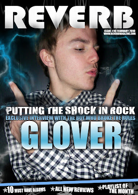
As you can see, the front cover is well and truly finished. Throughout this post, I will unpick and justify my decisions made during the process of producing my front cover and hope to make apparent the detail I have included.


Front Cover


Before embarking on producing my magazine, I knew instantaneously that by using such a genre as Electronic Indie, use of graphics mainly concerning that of lighting bolts and smoke brushes would be ideal for the particular style I would attempt to achieve. The genre of such music can be visually described as amplifying a highly contemporized and vibrant display of checkered whites and blacks, blues and ideally another colour which in a successful approach communicates the rebellious and alternative nature of the described genre. The very fact that I would at first be constructing a front page, highlighted to great extent a justification of exaggeration in regards to my use of colours, graphics and layouts. After learning from my preliminary task in which the matter of my front cover was focused on intensely, I knew instantaneously that capturing the genre of both the music and magazine acted as a pivotal aspect, being due to it of course standing as the main selling point of my magazine and informative visual “show” of sorts which would indefinitely decide on whether a perpetual consumer would become, officially, a consumer. It is due to this that I decided to take into account my themes, what graphics and colours I could possibly use to communicate such, and to what extent I would do so. And being that it was in fact a front cover I was working on, I knew that I had to take this opportunity to sell my magazine and mentally “wow” my audience. Ideally, align with what most picture the sub-genre of electronic indie to be; the strive to be unique and bold. The strive to be rebellious.


I began the production of my front cover with a distinct vision for what I liked to call my “million dollar shot”, the image which would primarily stand out as the visual to enforce that more than a suttle glance is achieved when standing on the magazine rack. Distinctly, my magazine required a subject to instantly enforce the overall vibe of my chosen music genre, capturing an image of youthfulness, rebel, and charisma. I drew back to my research, in which I focused on who I would picture as my ideal reader. What did they wear? What would they picture as “cool”? And more importantly, how old were they? When considering how my model would be presented upon my photoshoot, I prioritised all of these questions and took into consideration that this piece of work would of course stand-alone. I pivotally couldn’t afford to take risks and use image which would be defined as unlike the genre I was attempting to capture, meaning that a stereotypical visual of what again my ideal reader would be related to became all too important. It seemed significant that my ideal reader should be able to connect to my magazine, extending their attention and drawing in to greater degree the audience who would be deemed suitable to frequently read such a genre of music magazine.
More of a point to evidently make use of common industry practice; I decided to demonstrate use of the clone-stamp tool within Photoshop to edit and smoothen out areas on my models skin (although such areas were of course already perfect!). Doing so helped me withhold a professional perspective upon the construction of my front cover, and keep in the mind of what an actual editor’s approach would be to differing such an image. More than this, I wanted to make clear a distinct level of detail and practice put into to the construction of this work, and appropriately make evident how even the most irrelevant imagery or seemingly un-needed work can and will in actual fact take place and be tampered with.

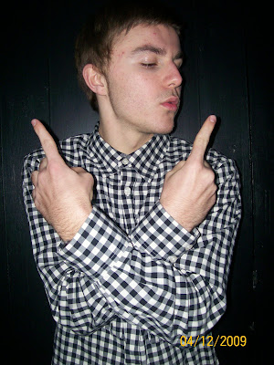
The following is a before and after of my subject


-Removal of red eye

-Straightening of eyebrow

-Darkening of hair

-Removal of forehead spots

-Overlay of shadow (burn tool) upon models neck and forehead to implicate lightning effects

-Softening of skin upon certain areas

-Lightening (dodge tool) of certain areas to again realistically implicate lightning effects

Friday, 4 December 2009

Front Cover, Almost Finished

On Friday, I sucessfully managed to complete the task of taking the majority of images for my front cover, contents page and double spread. It was a fairly straight forward task ideally. I knew the images I wanted to take and I would like to say I more so managed to get them. That evening of the shoot, I began scowering through my images to find "the shot", and working on what will conclude to be my front cover.

Cover Shot


Cover Shot Edited (Unfinished)


When the front cover is well and truly finished, I'll make sure to post my justification of choices and make evident the construction process I took to produce my Front Cover design.


Thursday, 3 December 2009

My Ideal Reader


This is Cassie. At 18, she's well and truely of the "Rebel" stigma, wishing to stray away from the crowd and stand as above all unique. Very much intouch with the Indie genre of rock, she sustains a great admiration and liking for new, striking music. It is due to this that Cassie above all takes liking to the electronic sub genre of Indie; engaged with escapisim and expression presented in such a form of music.

Highly social and engaged in friendship, she regulary participates and often plans group outings, organized frequently with her highly acessed Facebook account. It through use of such networking sites that Cassie remains "in the know", remaining a regular guest at public or often private events hosted by both unknown and mainstream bands. She also at times performs in her own band, named "Untitled", announcing and making prevelant various pieces of there own music through use of Myspace Music.

Highlighting her free-spirit character, un influenced by the lifestyle choices of others, she regulary shops at Charity shops, putting together outfits of her own tastes to conform her own tailored style. Of course being a student, Cassie is yet to break the bank, meaning she makes regular trips to places such as Soho or Camden Market-being of high convienence due to their value for money, alternative style, and ease of accessability via transport (meaning her Oyster Card comes in especially useful).


The Plan, Part 2

Seeing as I'm quite behind at the moment, I thought it more then neccesary to put together a plan commenting on what I have to do and when I have to do it. This more then anything should allow me to get back on track.

3rd December
Finalise layout for Front Cover, Contents Page and Double Page Spread.

4th December
Carry out Photoshoot with models. Look into audio wave graphic and attempt to capture image on Audacity or Adobe Premiere Pro. Post photos as evidence on blog.

5th-6th December
Begin constructing front cover and contents page.

7th December
Begin constructing double page spread. Finish off front cover and contents page where neccesary. Post on blog.

8th December
Analysis of front cover and contents page. Justify fonts, graphics, colours, images ect.

9th December
Analysis of double page spread.


Tuesday, 1 December 2009

Logo Design, Consideration of Layout


The following is the logo of which I am more or less settled to implicate into the design of my front cover.
I chose overall to make present an element of uniqueness about my logo design, aligning with the context of the magazine belonging to a sub-genre of indie/rock (electronic indie). I wanted in the simplist of terms to have a logo which above all stands out, un touched by the dozens of magazines on it's left and right. This would in marketing and presentation values prove to be pivotal in selling of the magazine to petentual buyers. But why "Reverb" you ask? Reverb to me captures the very element of technology, relevant due to it's overwhelming part in the production of the likes of electronic indie. "Reverb" refers to a frequently used audio effect present in most common music editing programs (e.g audacity), being that of an echo or prelonging the depth of sound. But quite simply, Reverb is simple, short and snappy. Following in the style of one word magazine phrasing such as "Kerrang" and "Clash", such a word bears a staple in a customers mind. They don't have to remember it. It simply just "sticks" to you.

When I eventually finish the likes of my front cover, I may however come to differ this logo design, adding possible implications such as audio waves behind the logo to tie into the theme of audio technology and electronic indie.


Monday, 23 November 2009

Consideration of Colours, Lighting and Themes

Upon studying a selection of magazines in designated groups, we began once again unpeeling editorial decisions and justifying the selection of colours, lighting and themes. Examining an issue of "Classic Rock", main content concerning the mysterious death of Jimmi Hendrix. Overall colour selection ranged from that of Blacks, Whites, Greys, Browns and Reds. Such a suttle composite of colours overall helped sustain a respectful yet dark tone, corresponding with the
featured content.

Situating with the nature of the feature, images constrain a de-saturated visual pallete and therefore communicate a mise en scene (everything within the frame/image) of dark undertone. Such themes are continued throughout the double page spread, ending on a image of contrasting nature with engaging florescent multi-colour. This overall paints an image of postitivity and respectfully takes note of the historic figure of which is Jimmi Hendrix (fitting due to the fact that this is very much a classic rock magazine). Use of such undertones in images sparked a possible method in which I could perhaps lay out my final set of images in both my front cover, content page and double page spread.

Tuesday, 17 November 2009

Feedback and Development

Feedback and Constructive Criticism

After handing in my preliminary task, I underwent a conversation with my teacher to receive feedback on my completed task. Overall, feedback was generally positive and highly complemintive of the detail in which I had enforced into my work.

Of the points discussed, the following contributed t0 the ideal improvement of the way in which I undertake what will eventually be my main task.

-Different font for date on cover

-Different size font for content details-maybe resize other pictures to allow more room for this in your layout

-More variation in your choice of location/setting for the front cover photos

-Consideration of your colour choice for the contents page


By hearing such points in reference to the de-construction of my preliminary task, I felt strongly that I from here was more aware of the slightest of details I would have to keep in mind when in the process of developing my Music Magazine.