As you can see, the front cover is well and truly finished. Throughout this post, I will unpick and justify my decisions made during the process of producing my front cover and hope to make apparent the detail I have included.
Front Cover

Before embarking on producing my magazine, I knew instantaneously that by using such a genre as Electronic Indie, use of graphics mainly concerning that of lighting bolts and smoke brushes would be ideal for the particular style I would attempt to achieve. The genre of such music can be visually described as amplifying a highly contemporized and vibrant display of checkered whites and blacks, blues and ideally another colour which in a successful approach communicates the rebellious and alternative nature of the described genre. The very fact that I would at first be constructing a front page, highlighted to great extent a justification of exaggeration in regards to my use of colours, graphics and layouts. After learning from my preliminary task in which the matter of my front cover was focused on intensely, I knew instantaneously that capturing the genre of both the music and magazine acted as a pivotal aspect, being due to it of course standing as the main selling point of my magazine and informative visual “show” of sorts which would indefinitely decide on whether a perpetual consumer would become, officially, a consumer. It is due to this that I decided to take into account my themes, what graphics and colours I could possibly use to communicate such, and to what extent I would do so. And being that it was in fact a front cover I was working on, I knew that I had to take this opportunity to sell my magazine and mentally “wow” my audience. Ideally, align with what most picture the sub-genre of electronic indie to be; the strive to be unique and bold. The strive to be rebellious.

More of a point to evidently make use of common industry practice; I decided to demonstrate use of the clone-stamp tool within Photoshop to edit and smoothen out areas on my models skin (although such areas were of course already perfect!). Doing so helped me withhold a professional perspective upon the construction of my front cover, and keep in the mind of what an actual editor’s approach would be to differing such an image. More than this, I wanted to make clear a distinct level of detail and practice put into to the construction of this work, and appropriately make evident how even the most irrelevant imagery or seemingly un-needed work can and will in actual fact take place and be tampered with.
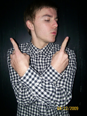
The following is a before and after of my subject

-Removal of red eye
-Straightening of eyebrow
-Darkening of hair
-Removal of forehead spots
-Overlay of shadow (burn tool) upon models neck and forehead to implicate lightning effects
-Softening of skin upon certain areas
-Lightening (dodge tool) of certain areas to again realistically implicate lightning effects


No comments:
Post a Comment